Community Commitment is out, ‘Building Relationships’ is in.
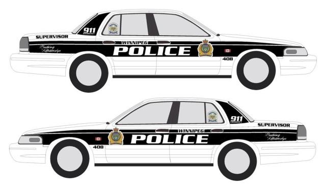
Members of the Winnipeg Police Service have been asked to participate in a selection process to choose a new ‘look’ for Winnipeg Police patrol units. The process will involve members visiting Policenet, logging in and casting a vote for one of two designs.
The new look will feature a black on white as opposed to blue on white color scheme.
The colour is not all that’s being altered. The Police Service’s long standing motto “Community Commitment” will be removed and replaced by the current administration’s favorite buzz words. You guessed it, patrol units will be adorned with “Building Relationships”.
It is not anticipated that the words “Community Commitment” will be removed from the Police Service badge. The heraldic design and wording incorporated in the badge was personally approved by the Queen. Any change to the badge would require royal approval.
According to a recent email sent to all members of the Police Service by the Chief, the new colour scheme and logo is designed to enhance safety in terms of greater visibility, improve the image of the Service, and increase officer morale.
The two proposed patrol unit designs are shown below.


I like the Brandon Police car colours which is a more classic black and white.
LikeLike
I’d say it’s fairly obvious they haven’t bothered to work with a designer on these concepts. They both reek of “design by committee”, and the font choice for the tagline is particularly brutal.
Another related question would be what vehicle the WPS plans to use for it’s patrol units once the Crown Vic stops production next year. The rumoured law enforcement version of the new Taurus?
LikeLike
[…] to former dep. chief Menno Zacharias, the Winnipeg force is soliciting opinions from officers about their preference for a new design […]
LikeLike
I’m in agreement with “PolicyFrog” on his “design by committee” quote.
The lower design containing the sweeping highway look is similar to the Toronto Police “Crest Toothpaste colours” and design, but without their ugly lettering font for “Police”. They had yellow police cars until mid-80s, then followed the crowd with all white cars, except for a straight blue and red lines stretching from front to back.
After an absence of about 20 years, the OPP (Ontario Provincial Police) have returned to their traditional black & white colours (three years ago), which is an acceptable colour scheme from my standpoint.
If I had to choose between the two designs above, my choice would fall on the 2nd display, although I suggest they return to the drawing board, because they can do better.
To get some better ideas, they could cast their net far and wide to research (US) state police cars, some of which look very professional, as well as very business-like and not looking like a committee designed them.
LikeLike